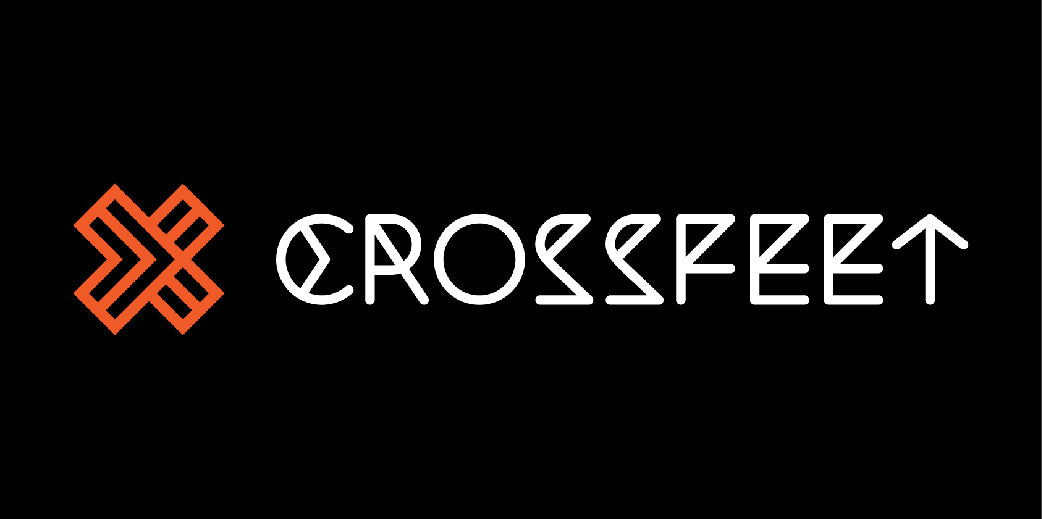
Both our brand name and logo have rich meanings behind them and represent who we are and what we do profoundly.
Crossfeet is a play of words. What better way to represent a brand of socks made and designed specially for cross training and other types of functional workouts?
As fitness junkies and sock geeks, our founders brainstormed for a brand name that can incorporate both the attributes of functional fitness as well as socks. It was during a taxi ride when co-founder Litsan was sitting cross-legged. “What about Crossfeet?” asked Pontus, in the spur of the moment. The best part is, it rhymes.
For the colour, our founders wanted something fun, daring, adventurous, playful and minimalist all at the same time. The colors orange represents joy, fun, confidence, and fearlessness; while black for power, strength, timelessness and minimalism.
The “C” and “T” of the logotype ![]() involves arrows. They represent our desire for continual improvements – the growth mindset. In life or in the gym, we can always improve and there’s always something to be improved upon if we look closely.
involves arrows. They represent our desire for continual improvements – the growth mindset. In life or in the gym, we can always improve and there’s always something to be improved upon if we look closely.
As for the logo, it’s derived from the letter X, amalgamated with the motif of arrows to represent our belief in continual growth. The letter X also represents the word ‘cross’. Each of the “arrow” is also shaped like a sock – in minimalist perspectives.
The overall concept and design reinforce our beliefs. As growth is the only path to a better and fulfilled life.
We’re Crossfeet.


